

In this article, we will understand working with the bootstrap accordion. When working with React, React does not have its own set of elements to integrate into the React component. So, we will need to use some popular and frequently used libraries such as react-bootstrap which provides bootstrap elements for the React app.
To understand accordions, accordions are used to create tabbed elements and hide/show content based on collapsible tabs, followed by their child content elements.
react-bootstrap
The most popular front-end framework is Rebuilt for React. It provides various bootstrap components that can be plugged in and played for a React app. When working with accordion, using react-bootstrap, there is an element called that allows you to toggle content based on a click event. This guide will cover the implementation.
React-Bootstrap is a complete re-implementation of the Bootstrap components using React. It has no dependency on either bootstrap.js or jQuery. If you have React setup and React-Bootstrap installed, you have everything you need.
Let’s first learn to include Bootstrap in our project. First, we will create a react application using Create-react-app. We can use the command given below to create a react application, you can change the name of the project as required, here I am using the project name as demo-bootstrap-accordion. The name given here will be the name of the project and a new directory will be created on the path on which the command runs.
npx create-react-app demo-bootstrap-accordionInstalling react-bootstrap
To install react-bootstrap in our project, let’s install it using the npm package. To install the package open the project that we created in the step above and run the command to install react-bootstrap
npm install react-bootstrap [email protected]Importing components
When working with react-bootstrap, we need to import the components that we want to use using the import statement. When importing the components from react-bootstrap, we should import individual components like react-bootstrap/Button rather than the entire library. Doing so pulls in only the specific components that you use, which can significantly reduce the amount of code you end up sending to the client.
import Button from 'react-bootstrap/Button';

// or less ideally
import { Button } from 'react-bootstrap';
Importing Stylesheets
As react-bootstrap doesn’t depend on a very precise version of Bootstrap, no CSS is included. But we need to import some stylesheets to use these components. The following line can be included in your src/index.js or App.js file
import 'bootstrap/dist/css/bootstrap.min.css';Example
Let’s take an example from the official site to compare a simple component when implemented using react-bootstrap and bootstrap.
Bootstrap
function Example() {
return (
<div class="alert alert-danger alert-dismissible fade show" role="alert">
<strong>Oh snap! You got an error!</strong>
<p>
Change this and that and try again.
</p>
<button type="button" class="close" data-dismiss="alert" aria-label="Close">
<span aria-hidden="true">×</span>
</button>
</div>
)
}React-Bootstrap
import * as React from 'react';
import Alert from 'react-bootstrap/Alert';

function Example() {
  return (
    <Alert dismissible variant="danger">
      <Alert.Heading>Oh snap! You got an error!</Alert.Heading>
      <p>
        Change this and that and try again.
      </p>
    </Alert>
  )
}
Getting Started with react-bootstrap Accordion
As we have already installed the react-bootstrap package, we would be able to use all the components provided by the package. In this article, we will mainly focus on the component used for building Accordions.
As we have created the project, let’s create a new component that would include the Accordion examples.
Starting with creating a file named “Examples.jsx” in the src folder. We will create component Examples, that will include various scenarios of Accordion.
Examples.jsx
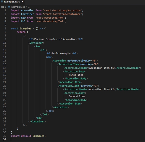
import Accordion from 'react-bootstrap/Accordion';
import Container from 'react-bootstrap/Container';
import Row from 'react-bootstrap/Row';
import Col from 'react-bootstrap/Col';

const Examples = () => {
    return (
        <>
            <h2>Various Examples of Accordion</h2>
            <Container>
                <Row>
                    <Col>
                        <h3>Basic example</h3>
                        <div>
                            <Accordion defaultActiveKey="0">
                                <Accordion.Item eventKey="0">
                                    <Accordion.Header>Accordion Item #1</Accordion.Header>
                                    <Accordion.Body>
                                        First Item
                                    </Accordion.Body>
                                </Accordion.Item>
                                <Accordion.Item eventKey="1">
                                    <Accordion.Header>Accordion Item #2</Accordion.Header>
                                    <Accordion.Body>
                                        Second Item
                                    </Accordion.Body>
                                </Accordion.Item>
                            </Accordion>
                        </div>
                    </Col>
                </Row>
            </Container>
        </>
    )
}
export default Examples;
When we want to use any component from react-bootstrap we need to import the component first, as we have imported the Accordion component in the imports section. We have also used some other components such as Container, Row, and Column, which would help us to set the proper layout on the page.
As we have created a new component “Examples”, now we need to import the same in the App.js component as we need to display its contents on our home screen.
App.js
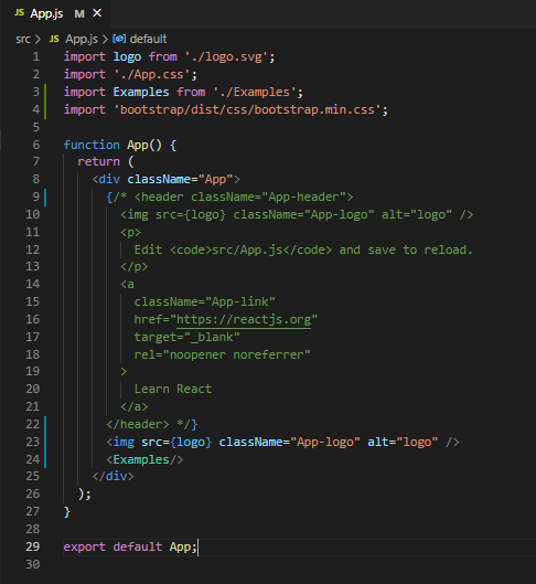
import logo from './logo.svg';
import './App.css';
import Examples from './Examples';
import 'bootstrap/dist/css/bootstrap.min.css';

function App() {
  return (
    <div className="App">
      {/* <header className="App-header">
        <img src={logo} className="App-logo" alt="logo" />
        <p>
          Edit <code>src/App.js</code> and save to reload.
        </p>
        <a
          className="App-link"
          href="https://reactjs.org"
          target="_blank"
          rel="noopener noreferrer"
        >
          Learn React
        </a>
      </header> */}
      <img src={logo} className="App-logo" alt="logo" />
      <Examples/>
    </div>
  );
}

export default App;
Example component can be imported as shown on line 3 and to use the component we can use it as shown on line 24. I have commented on the header section and added the Example component on line 24.
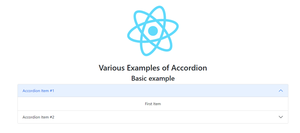
Here is how it looks.
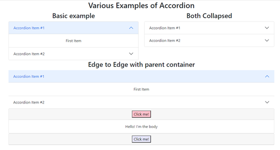
We can also add some custom options if we want to have different styles for the toggle if its associated section is expanded; this can be achieved with a custom toggle that is context-aware.
Watch out!
Please note if you come across any error stating something like this “Error: Cannot find module ‘D:\react-scripts\bin\react-scripts.js’”, I would suggest to check the path of the project. If the path of the project includes “&” then there are chances of not being able to run the project.
If you have an & in your project’s path you will run into this issue, at least on Windows it seems like. The part in the path after the & is interpreted as another command as per the error and everything breaks from there.
Conclusion
The accordion is the best choice when the user interface should be collapsed and able to utilize the web page space to expand the content when required.
Apart from react-bootstrap, you can try accordion from other third-party libraries such as material-ui based on the UI specification and requirement to effectively show the required content.


