

In the ever-changing landscape of web development, creating select elements for your projects has evolved from a breeze to a crucial aspect of delivering an exceptional user interface and experience. Today, attention to detail is paramount, especially when it comes to handling select elements.
Modern web developers must now consider a range of essential features, such as on-focus behavior, remote data fetching, and custom styling for select elements. If you’re currently working on a React project, you’ve likely wished for a convenient and reusable component to simplify your workflow.
Fear not, as your wish is about to be granted! Join us on an exciting journey through the world of React-Select – a renowned and widely adopted library for handling dropdowns and select boxes. Whether you’re a seasoned React developer or a curious newcomer to the framework, this comprehensive guide will equip you with the knowledge and skills to fully harness the power of React-Select, ultimately elevating the user experience of your projects.
What is React Select?
React-Select is a popular and feature-rich open-source library for handling dropdowns and select boxes in React applications. Developed by Jed Watson and supported by Thinkmill and Atlassian, React-Select provides an elegant and seamless solution to the complexities of creating interactive and user-friendly select elements.
React-Select simplifies the process of building dynamic and interactive dropdown components, making it a go-to choice for developers working on React projects. Whether you’re an experienced React developer or a newcomer to the framework, React-Select’s versatility and ease of use enable you to elevate your projects with elegant and functional dropdowns.
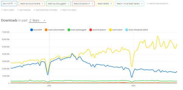
Popularity of react-select
In the vast landscape of React dropdown libraries, developers often face the challenge of selecting the most suitable option for their projects. Amongst the contenders like downshift, react-autocomplete, react-autosuggest, react-dropdown, and react-virtualized-select, React-Select stands out as the undisputed favorite, boasting widespread popularity and adoption.
Installation and usage
React-Select is an excellent choice for enhancing the user experience of your React applications with versatile and interactive dropdowns. Whether you’re a seasoned React developer or just starting with the framework, this step-by-step guide will walk you through the process of working with React-Select, making the integration seamless and enjoyable.
Let’s dive in and explore the essential steps to get started with React-Select, empowering you to create powerful and user-friendly select elements that elevate your web projects to new heights.
How to install React Select?
The first step is to install react-select into your project. You can use npm or yarn to add React-Select as a dependency. Open your terminal or command prompt and run the following command:
npm install react-selectHow to use React Select?
After installing React-Select, you need to import it into your React component where you want to use it. Add the following import statement at the top of your component file:
import Select from 'react-select';Create Options Data
Next, you’ll need to prepare the options data that will populate the dropdown. React-Select requires an array of objects, each representing an option with a `label` and `value`. For example:
const options = [
  { label: 'Option 1', value: 'option1' },
  { label: 'Option 2', value: 'option2' },
  { label: 'Option 3', value: 'option3' },
];
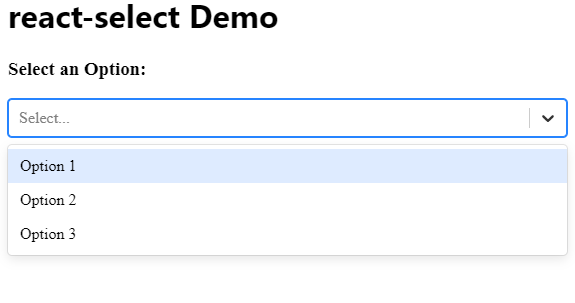
Implement React-Select Component
Now that you have the options data, you can integrate the React-Select component into your UI. Use the `Select` component with the options prop:
const MyComponent = () => {
  return (
    <div>
      <h1>Select an Option:</h1>
      <Select options={options} />
    </div>
  );
};
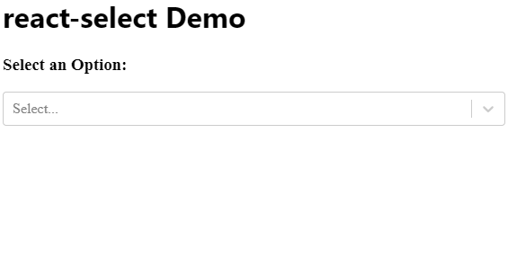
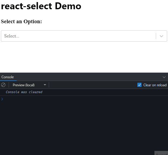
Handle Selected Value
To capture the selected value from the dropdown, use the `onChange` event handler. When the user selects an option, the `onChange` event provides the selected option object.
const MyComponent = () => {
  const handleSelectChange = (selectedOption) => {
    console.log('Selected Option:', selectedOption);
  };

  return (
    <div>
      <h1>Select an Option:</h1>
      <Select options={options} onChange={handleSelectChange} />
    </div>
  );
};
Customize Styling (Optional)
Optionally, you can customize the styling of your React-Select dropdown to match your project’s design. React-Select provides various props to control the appearance, including “styles”, “className”, and “theme”.
Explore Additional Features (Optional)
React-Select offers a plethora of additional features to enhance your dropdowns further.
In this example, we have created a multi-select dropdown and added animations to it.
import makeAnimated from 'react-select/animated';
...
const animatedComponents = makeAnimated();
...
<Select
   options={options}
   onChange={handleSelectChange}

   components={animatedComponents}
   closeMenuOnSelect={false}
   isMulti
 />
...
These include multi-select, async loading, grouping, and more. Check the official documentation for more details and examples.
How to integrate custom styles in react-select
React-Select offers incredible versatility, allowing you to create captivating dropdowns that seamlessly blend with your project’s design. By integrating custom styles, you can elevate the aesthetics and user experience of your React-Select components.
Let’s dive into the process of integrating custom styles in the React-Select component, empowering you to create stunning and user-friendly select elements that leave a lasting impression on your audience.
Prepare Your Custom Styles
Before we begin, create a JavaScript object that holds your custom styles. You can control various aspects of the dropdown, such as the background color, font size, and even animations. Refer to the official React-Select documentation for a list of style properties you can customize.
const customStyles = {
  control: (provided, state) => ({
    // Custom styles for the control wrapper
    // Example: backgroundColor: '#f2f2f2'
    ...provided,
  }),
  option: (provided, state) => ({
    // Custom styles for individual options
    // Example: fontSize: '16px'
    ...provided,
  }),
  // Add more custom styles for other elements as needed
};
Apply Custom Styles
Now that you have your custom styles defined, apply them to the React-Select component by passing the `styles` prop.
import Select from 'react-select';

const MyComponent = () => {
  return (
    <Select
      options={options}
      styles={customStyles}
    />
  );
};
Fine-Tune Styles with Conditional Logic (Optional)
For further customization, you can use the state provided in the styles functions to apply conditional styling based on the component’s state. For example, you can change the color of the dropdown when it is focused or change the appearance of selected options.
const customStyles = {
  control: (provided, state) => ({
    ...provided,
    backgroundColor: state.isFocused ? '#f2f2f2' : 'white',
    // Add more conditional styling as needed
  }),
  option: (provided, state) => ({
    ...provided,
    fontSize: state.isSelected ? '18px' : '16px',
    // Add more conditional styling as needed
  }),
};
Test and Refine
Test your React-Select component with the custom styles, and make adjustments as needed to achieve your desired visual outcome. Fine-tuning the styles ensures a harmonious integration with your project’s overall design.
OnChange and Autofocus in React-Select
React-Select not only provides a delightful dropdown experience but also offers powerful functionalities like OnChange and Autofocus. Let’s dive in and explore how to work with OnChange and Autofocus to elevate the interactivity and usability of your dropdowns.
Working with OnChange
The OnChange event in React-Select enables you to capture and respond to user selections within the dropdown. This functionality is essential when you need to trigger actions or update other parts of your application based on the user’s choice.
Define the OnChange Handler
Start by defining an OnChange event handler function that receives the selected option as its argument. This function will be called whenever the user makes a selection.
import Select from 'react-select';

const MyComponent = () => {
  const handleSelectChange = (selectedOption) => {
    // Do something with the selected option
    console.log('Selected Option:', selectedOption);
  };

  return (
    <Select
      options={options}
      onChange={handleSelectChange}
    />
  );
};
Implement Your Logic
Within the `handleSelectChange` function, you can perform any logic you desire based on the selected option. Update state, trigger actions, or communicate with your backend – the possibilities are endless.
Working with Autofocus
The Autofocus feature in React-Select automatically focuses on the dropdown when the component is rendered, making it instantly ready for user input. This is especially useful for forms or search interfaces where you want to streamline the user experience.
Enable Autofocus
To enable Autofocus, simply set the `autofocus` prop to `true` when rendering the React-Select component.
import Select from 'react-select';

const MyComponent = () => {
  return (
    <Select
      options={options}
      autofocus={true}
    />
  );
};
Enjoy Instant Interactivity
With Autofocus enabled, your React-Select dropdown will automatically be focused, ready for users to make selections without any additional clicks or keystrokes.
Conclusion
Throughout this article, we’ve unraveled the potential of React Select to enrich your React applications. By exploring common use cases, getting started with integration, and mastering customization, you’re now equipped with the knowledge and skills to harness the true power of React Select. Embrace its capabilities to create captivating and user-friendly select elements that leave a lasting impact on your audience.
Some related articles
How to Create Toast Notifications in React with React Toastify?
Package.json Explained
Creating reusable components in React
How to use Bootstrap with React?


