

In today’s web development landscape, creating beautiful and user-friendly forms is crucial. Material UI, a popular React UI framework, provides a robust set of components for building elegant user interfaces. In this guide, we will walk you through the process of creating a form using Material UI, making your web applications more visually appealing and user-friendly.

Create a new React App
To get started, you’ll need to create a new React application. We’ll use the create-react-app installer, which is a convenient tool for generating React projects. Open your terminal and follow these steps:
Navigate to the Desired Folder
First, use the cd (change directory) command to navigate to the folder where you want to create your React application. For example:
cd path/to/your/folderReplace path/to/your/folder with the actual path to your chosen folder location.
Create React App
Once you’re inside the desired folder, run the following command:
npx create-react-app material-ui-demoIn this command:
- npx is a package runner tool that comes with Node.js and is used to execute packages from the npm registry.
- create-react-app is a command-line tool for creating React applications.
- material-ui-demo is the name of your new React application. You can replace this with your preferred project name.
Navigate to the Project Folder
After running the create-react-app command, it will generate the necessary files and folders for your React application. To work on your new project, navigate to the folder created by the create-react-app command using the cd command:
cd material-ui-demoNow you’re inside the project folder, ready to proceed with installing Material UI. Now let’s move on to a more detailed explanation of how to install Material UI in a React project.
Install Material UI with npm or Yarn
Material UI is a popular React component library that provides pre-designed, customizable UI components. To use it in your project, you need to install the Material UI package. You have two options for package managers: npm or Yarn. Choose the one you prefer.
Using npm (Node Package Manager)
To install Material UI with npm, run the following command in your terminal:
npm install @mui/material @emotion/react @emotion/styledIn this command:
- npm install is used to install packages from the npm registry.
- @mui/material is the main Material UI package containing the core components and styles.
- @emotion/react and @emotion/styled are required for styling and theming in Material UI.
Using Yarn
If you prefer Yarn as your package manager, you can install Material UI by running the following command:
yarn add @mui/material @emotion/react @emotion/styledIn this command:
- yarn add is used to add packages to your project using Yarn.
- @mui/material is the main Material UI package.
- @emotion/react and @emotion/styled are also included for styling and theming.
Import Material UI Components
In your React component file where you plan to create the registration form, you need to import the necessary Material UI components and styles. These components will allow you to build the form, and styles will help you customize its appearance.
The following components are required for creating a simple form:
- FormControl: This component is the container for the form inputs.
- FormLabel: This component is used to label the form inputs.
- Input: This component is used to create input fields.
You can import components like TextField, Button, FormControl and other required components from @mui/material. You can import these components by adding the following import statements to your code:
import React, { useState } from "react";
import {
  Input,  FormControl,  InputLabel,  FormHelperText,  Checkbox,  Switch,  FormControlLabel,    Stack,  Button,  TextField } from "@mui/material";
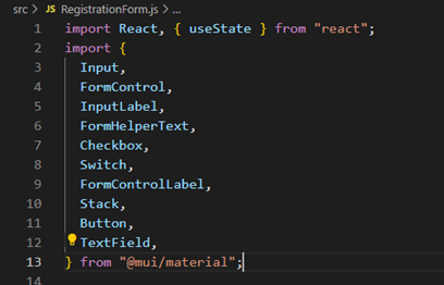
By importing these components, you gain access to pre-built UI elements such as text fields and buttons, etc. which will be used in the form.
Create the Registration Form Component
The next step is to create a form container. The form container is the element that will wrap all of the form inputs. You can create a form container by using the FormControl component.
Let’s define the registration form component. Start by creating the basic structure of your form using Material UI components. In this example, we will create fields for the user’s first name, last name, email, phone number, password, confirm password, date of birth, whether the user wants to receive regular updates or not, and a checkbox for whether the user agrees to the terms and conditions.
const RegsitrationForm = () => {
  return (
	<div>
		<form>
		     // Your form inputs here
		</form>
</div>
   );
};
Add form inputs
Once you have created the form container, you can add the form inputs. The form inputs can be any of the Material UI components that are used to create input fields, such as the Input, Switch, and Checkbox components.
For example, the following code creates a form field with a first name input field and last name input field:
const Form = () => {
  return (
    <FormControl>
            <InputLabel htmlFor="fname">First Name</InputLabel>
            <Input
              autoFocus="true"
              id="fname"
              value={firstName}
              onChange={(e) => setFirstName(e.target.value)}
            />
            <FormHelperText id="my-helper-text">
              Please enter your first name.
            </FormHelperText>
          </FormControl>

          <FormControl>
            <InputLabel htmlFor="lname">Last Name</InputLabel>
            <Input
              id="lname"
              value={lastName}
              onChange={(e) => setLastName(e.target.value)}
            />
            <FormHelperText id="my-helper-text">
              Please enter your last name.
            </FormHelperText>
          </FormControl>  );
};
By adding some other fields as per the requirement of the form, you can add some more fields and create a registration form. Copy the code snippet below to create the registration form:
const RegistrationForm = () => {
  const [firstName, setFirstName] = useState("");
  const [lastName, setLastName] = useState("");
  const [email, setEmail] = useState("");
  const [phnNumber, setPhoneNumber] = useState("");
  const [dateOfBirth, setDateOfBirth] = useState("");
  const [password, setPassword] = useState("");
  const [cnfpassword, setcnfPassword] = useState("");
  const [checked, setChecked] = useState(false);
  const [checkedUpdates, setCheckedUpdates] = useState(true);

  return (
    <div>
      <h1 style={{ color: "darkgrey" }}>Let's React's Form Container</h1>
      <h2 style={{ color: "Blue" }}>Registration form Example</h2>
      <form style={{ paddingTop: "10px", paddingLeft: "500px" }}>
        <Stack spacing={2} direction="row" sx={{ marginBottom: 4 }}>
          <FormControl>
            <InputLabel htmlFor="fname">First Name</InputLabel>
            <Input
              autoFocus="true"
              id="fname"
              value={firstName}
              onChange={(e) => setFirstName(e.target.value)}
            />
            <FormHelperText id="my-helper-text">
              Please enter your first name.
            </FormHelperText>
          </FormControl>
          <FormControl>
            <InputLabel htmlFor="lname">Last Name</InputLabel>
            <Input
              id="lname"
              value={lastName}
              onChange={(e) => setLastName(e.target.value)}
            />
            <FormHelperText id="my-helper-text">
              Please enter your last name.
            </FormHelperText>
          </FormControl>
        </Stack>
        <Stack spacing={2} direction="row" sx={{ marginBottom: 4 }}>
          <FormControl>
            <InputLabel htmlFor="email">Email address</InputLabel>
            <Input
              id="email"
              value={email}
              aria-describedby="my-helper-text"
              onChange={(e) => setEmail(e.target.value)}
            />
            <FormHelperText id="my-helper-text">
              We will never share your email.
            </FormHelperText>
          </FormControl>
          <FormControl>
            <InputLabel htmlFor="phnNumber">Phone Number</InputLabel>
            <Input
              id="phnNumber"
              value={phnNumber}
              aria-describedby="my-helper-text"
              onChange={(e) => setPhoneNumber(e.target.value)}
            />
            <FormHelperText id="my-helper-text">
              Please enter your phone number here.
            </FormHelperText>
          </FormControl>
        </Stack>
        <Stack spacing={2} direction="row" sx={{ marginBottom: 4 }}>
          <FormControlLabel
            control={
              <TextField
                type="date"
                value={dateOfBirth}
                onChange={(e) => setDateOfBirth(e.target.value)}
              ></TextField>
            }
            label="Select you date of birth"
          />
        </Stack>
        <Stack spacing={2} direction="row" sx={{ marginBottom: 4 }}>
          <FormControl>
            <InputLabel htmlFor="pswd">Password</InputLabel>
            <Input
              type="password"
              id="pswd"
              value={password}
              aria-describedby="my-helper-text"
              onChange={(e) => setPassword(e.target.value)}
            />
            <FormHelperText id="my-helper-text">
              Enter your password here.
            </FormHelperText>
          </FormControl>
          <FormControl>
            <InputLabel htmlFor="cnfPswd">Confirm Password</InputLabel>
            <Input
              type="password"
              id="cnfPswd"
              value={cnfpassword}
              aria-describedby="my-helper-text"
              onChange={(e) => setcnfPassword(e.target.value)}
            />
            <FormHelperText id="my-helper-text">
              Please re-enter your password here.
            </FormHelperText>
          </FormControl>
        </Stack>
        <Stack>
          <FormControl>
            <FormControlLabel
              control={
                <Switch
                  // defaultChecked
                  checked={checkedUpdates}
                  onChange={(e) => setCheckedUpdates(e.target.checked)}
                />
              }
              label="Receive regular updates."
            />
          </FormControl>
          <FormControl>
            <FormControlLabel
              control={
                <Checkbox
                  id="agree"
                  checked={checked}
                  onChange={(e) => setChecked(e.target.checked)}
                />
              }
              label="I agree to the terms and conditions."
            />
          </FormControl>
        </Stack>
        <Button variant="contained" color="success" type="submit">
          Register
        </Button>
      </form>
    </div>
  );
};
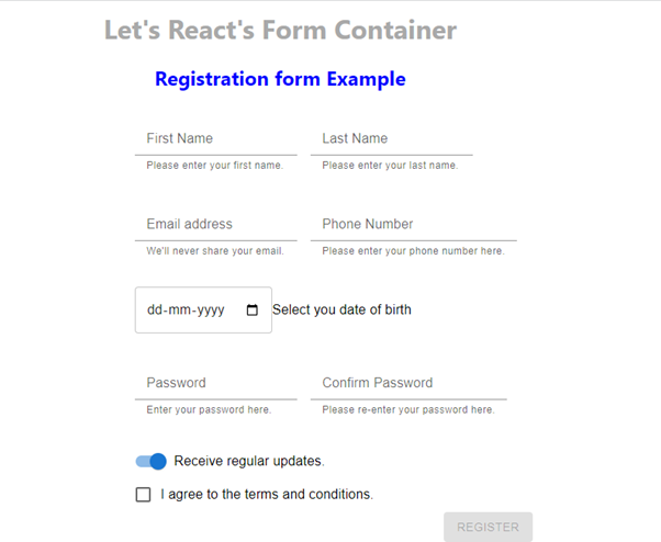
The output would look something as shown in the screenshot below:
Adding states for managing the form values
You can save the values entered in the form using the useState hook. Add constants for every field value that you need to save in the component. For example, we have firstName, lastName, email, phnNumber, etc. for every of the field values in the form.
const [firstName, setFirstName] = useState("");
const [lastName, setLastName] = useState("");
const [email, setEmail] = useState("");
const [phnNumber, setPhoneNumber] = useState("");
const [dateOfBirth, setDateOfBirth] = useState("");
const [password, setPassword] = useState("");
const [cnfpassword, setcnfPassword] = useState("");
Handle form submission
The final step is to handle the form submission. The form submission event is triggered when the user clicks the Register button. You can handle the form submission event by using the onSubmit prop on the FormControl component.
The onSubmit prop takes a function as an argument. This function will be called when the user submits the form. In this function, you can do whatever you need to do with the form data, such as saving it to a database or sending it to an API.
For example, the following code handles the form submission event by logging the form data to the console:
const Form = () => {
const [name, setName] = useState("");
return (
<FormControl onSubmit={(e) => {
console.log("Form submitted.");
e.preventDefault();
}}>
<FormLabel htmlFor="name">Name</FormLabel>
<Input id="name" value={name} onChange={(e) => setName(e.target.value)} />
</FormControl>
);
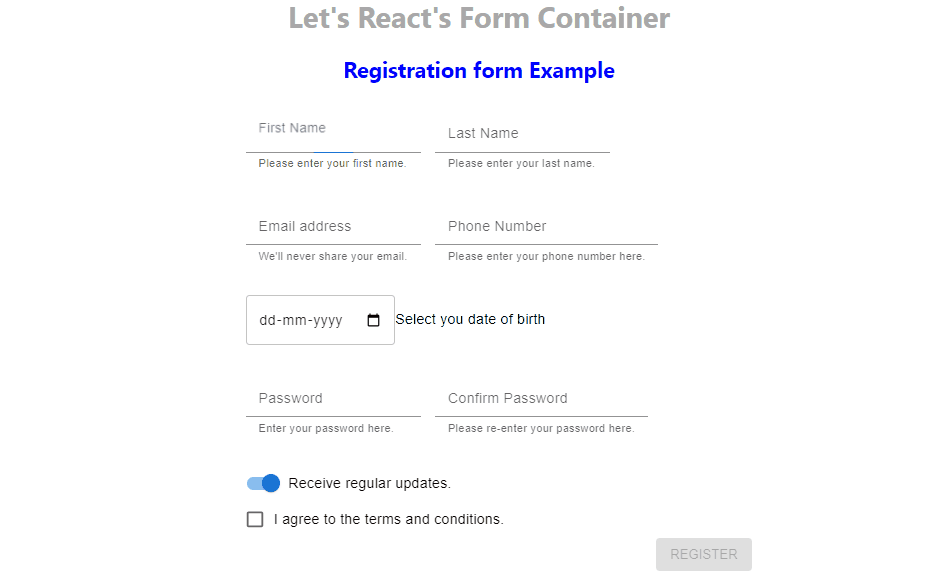
};By following these steps registration form that you created by following the steps above would look as:
Create the Form Component using makestyles
Now, let’s define your form component. Start by designing the form structure using Material UI components. Here’s a basic example:
const useStyles = makeStyles((theme) => ({
  form: {
    display: 'flex',
    flexDirection: 'column',
    maxWidth: '300px',
    margin: '0 auto',
  },
  textField: {
    margin: theme.spacing(1),
  },
  button: {
    margin: theme.spacing(2),
  },
}));

const MyForm = () => {
  const classes = useStyles();

  return (
    <form className={classes.form}>
      <FormControl>
        <TextField
          label="Name"
          variant="outlined"
          className={classes.textField}
        />
        <TextField
          label="Email"
          variant="outlined"
          className={classes.textField}
        />
        {/* Add more fields as needed */}
        <Button
          variant="contained"
          color="primary"
          className={classes.button}
        >
          Submit
        </Button>
      </FormControl>
    </form>
  );
};

export default MyForm;
Styling and Customization
Use the makeStyles hook to customize the form’s appearance further. Adjust margins, colors, and typography to match your project’s design requirements.
Conclusion
Creating a form with Material UI can significantly enhance the user experience of your web applications. By following this step-by-step guide, you can quickly integrate Material UI components into your React project and design elegant, responsive forms. Don’t forget to customize the form’s appearance and implement the necessary functionality for your specific use case.


