
Implementing a light/dark mode using React context is a great way to manage the theme of your application across multiple components. You can create a ThemeProvider that provides the current theme to your components, and you can toggle the theme from any part of your app. Let’s first understand the concepts of context in React as we will be using context for implementing a dark theme/light theme in the Application.
Context in React
React Context is an advanced feature that allows you to share state data, functions, or other values between components in a React application without the need to explicitly pass props through each level of the component tree. It’s particularly useful for scenarios where data needs to be accessed by multiple components at different levels of nesting.
Here are some key details about React Context:
1. Context Creation:
- To create a context, you use the createContext function provided by React. It returns an object with two components: Provider and Consumer.
2. Provider Component:
- The Provider component is used to wrap a part of your component tree where you want to make the context data available. It takes a value prop, which can be any JavaScript value (e.g., an object, a function, a string).
3. Consumer Component (Deprecated):
- The Consumer component is used to consume the context data within a component. However, it is considered deprecated in favor of using the useContext hook, which is more concise and easier to use.
4. useContext Hook:
- The useContext hook is the modern way to consume context in functional components. It allows you to access the context value directly within a component. You simply pass the context object (created using createContext) as an argument to useContext, and it returns the current context value.
5. Context Flow:
- Context provides a way to pass data through the component tree without having to pass props manually at every level. When a component subscribes to a context, it will automatically re-render when the context value changes.
6. Multiple Contexts:
- You can create multiple context providers in your app, each responsible for different types of data. This allows you to organize and manage the sharing of data efficiently.
7. Default Values:
- Context providers can also specify default values for context data. If a component consumes context but doesn’t find a matching provider in its ancestor tree, it will use the default value.
How to implement dark/light mode in React?
To implement dark/light mode in any of the React applications, here are the steps for implementation:
Create a ThemeContext
First, create a ThemeContext.js file to define your context:
import React, { createContext, useState, useContext } from 'react';

const ThemeContext = createContext();

export const useTheme = () => {
  return useContext(ThemeContext);
};

export const ThemeProvider = ({ children }) => {
  const [theme, setTheme] = useState('light');

  const toggleTheme = () => {
    setTheme((prevTheme) => (prevTheme === 'light' ? 'dark' : 'light'));
  };

  return (
    <ThemeContext.Provider value={{ theme, toggleTheme }}>
      {children}
    </ThemeContext.Provider>
  );
};
In this code:
- We create a ThemeContext using createContext from React.
- We define a ThemeProvider component that wraps its children with the context provider.
- Inside ThemeProvider, we manage the current theme with the useState hook.
- We provide a toggleTheme function to toggle between ‘light’ and ‘dark’ themes.
Wrap Your App with ThemeProvider
Wrap your entire application with the ThemeProvider in your main component or App.js:
import "./App.css";
import NavBar from "./Components/NavBar";
import ErrorPage from "./Pages/ErrorPage";
import ContactUs from "./Pages/ContactUs";

import { ThemeProvider } from "./ThemeContext";

function App() {
  return (
    <ThemeProvider>
      <div className="App">
        <NavBar />
      </div>
    </ThemeProvider>
  );
}

export default App;
Use the Theme in Your Components
You can now use the theme in any of your components by importing and using the useTheme hook:
import React from "react";
import { useTheme } from "../ThemeContext.js";
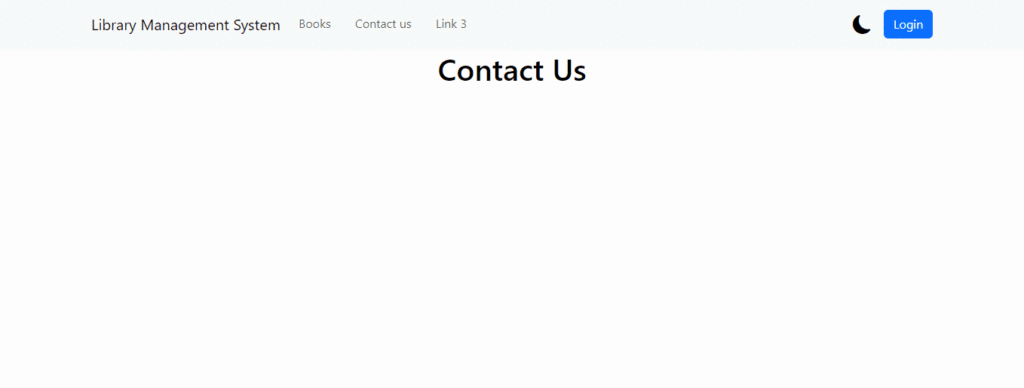
const ContactUs = () => {
const { theme } = useTheme();
return (
<div className={`App ${theme}`}>
<h1>Contact Us</h1>
<div></div>
</div>
);
};
export default ContactUs;
In this example, the toggleTheme function is used to toggle between ‘light’ and ‘dark’ themes, and the current theme is applied as a CSS class to the component.
Styling
In your CSS or styling solution (e.g., styled-components, CSS modules), define styles for both ‘light’ and ‘dark’ themes using the CSS classes you added to your components.
For example, in your CSS:
.App.dark,
.App.dark a {
  /* Dark Theme */
  background-color: #333 !important;
  color: white !important;
}

.App.dark.navbar,
.App.dark.navbar a {
  background-color: grey !important;
  color: white !important;
}
Now, when you call toggleTheme, the theme will toggle across all components that use the context.
You’ve implemented a light/dark mode using React context. This approach makes it easy to manage the theme state and apply it consistently throughout your application.


