

Material-UI is a popular React UI framework that provides a collection of customizable components to help developers create stylish and functional user interfaces. One of its core components is the TextField, which serves as a versatile input element for gathering text-based user inputs. In this article, we will dive into the details of how to effectively use the TextField component in Material-UI, along with SEO-optimized keywords to enhance your article’s visibility.
Understanding the TextField Component in Material-UI
The TextField component is a fundamental part of Material-UI’s design system. It allows developers to easily create input fields for various types of text-based inputs such as single-line inputs, multi-line inputs, password fields, and more. Here’s how you can get started using the TextField component effectively
Installation and Setup of Material UI
Before you can use Material-UI’s TextField component, make sure you have Material-UI installed in your project. You can install it using npm or yarn:
npm install @mui/materialHow to use the TextField component?
To use the TextField component, you’ll first need to import it into your component:
import TextField from '@mui/material/TextField';Now, you can integrate the TextField component into your UI:
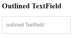
<TextField label="Username" variant="outlined" />In this example, we’ve created a basic input field with a label and an outlined variant. You can customize the appearance and behavior of the TextField using various props.
Different props of the TextField component
The TextField component offers a range of props that allow you to tailor its behavior to your needs. Some commonly used props include:
- label: Sets the label for the input field.
- variant: Specifies the visual variant of the TextField (e.g., outlined, filled).
- type: Determines the type of input (e.g., ‘text’, ‘password’, ’email’).
- placeholder: Provides a hint or example value for the user.
- onChange: Handles the change event when the user types in the input.
Handling State
To capture and manage the user’s input, you’ll need to manage the state of the TextField component. You can use React’s state management techniques or state management libraries like Redux.
import React, { useState } from 'react';

function MyComponent() {
  const [inputValue, setInputValue] = useState('');

  const handleInputChange = (event) => {
    setInputValue(event.target.value);
  };

  return (
    <TextField
      label="Message"
      variant="outlined"
      value={inputValue}
      onChange={handleInputChange}
    />
  );
}
Customization and Styling of TextField
Material-UI’s TextField component not only offers functionality but also provides ample opportunities for customization and styling to match the visual identity of your application. Here’s how you can tailor the appearance of the TextField component according to your design preferences
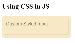
Using CSS-in-JS
Material-UI encourages the use of CSS-in-JS libraries like styled-components or @emotion/styled for styling components. This approach allows you to write styles directly in your JavaScript code, ensuring encapsulation and reusability.
import React from 'react';
import TextField from '@mui/material/TextField';
import { styled } from '@mui/system';

const CustomTextField = styled(TextField)({
  // Your custom styles here
  backgroundColor: 'lightgray',
  borderRadius: '8px',
  padding: '10px',
});

function MyComponent() {
  return <CustomTextField label="Custom Styled Input" variant="outlined" />;
}
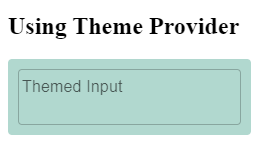
Using ThemeProvider
Material-UI’s ThemeProvider allows you to create a consistent look across your app by defining a theme. Themes contain a set of values for styling various components, including the TextField.
import React from 'react';
import { ThemeProvider, createTheme } from '@mui/material/styles';
import TextField from '@mui/material/TextField';

const theme = createTheme({
  components: {
    MuiTextField: {
      styleOverrides: {
        root: {
          // Your custom styles here
          backgroundColor: 'lightgray',
          borderRadius: '8px',
          padding: '10px',
        },
      },
    },
  },
});

function MyComponent() {
  return (
    <ThemeProvider theme={theme}>
      <TextField label="Themed Input" variant="outlined" />
    </ThemeProvider>
  );
}
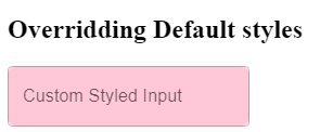
Overriding Default Styles
For more specific styling, you can use the classes prop to target and override specific CSS classes applied to the TextField component.
import React from 'react';
import TextField from '@mui/material/TextField';
import { makeStyles } from '@mui/styles';

const useStyles = makeStyles({
  root: {
    backgroundColor: 'lightgray',
    borderRadius: '8px',
    padding: '10px',
  },
});

function MyComponent() {
  const classes = useStyles();

  return (
    <TextField
      label="Custom Styled Input"
      variant="outlined"
      classes={{
        root: classes.root,
      }}
    />
  );
}
Global Styles
If you prefer global styles, you can apply styles to the TextField component through your global CSS file. However, remember that using global styles might lead to more complex maintenance and potential conflicts.
Conclusion
The TextField component in Material-UI simplifies the process of creating interactive and appealing input fields within your React applications. By following this comprehensive guide, you’ve learned how to effectively integrate, customize, and manage the TextField component, enhancing user experience and streamlining data collection. With the integration of SEO-optimized keywords, you’re now well-equipped to provide valuable insights to developers seeking guidance on utilizing the TextField component in Material-UI.

