
Typography is a fundamental aspect of web design that greatly influences the visual appeal and readability of your application. In Material-UI for React, a popular UI framework, you have a powerful toolset for controlling and customizing typography. In this article, we’ll explore how to leverage Material-UI’s typography system to create visually appealing and responsive designs for your React applications.
Understanding Material-UI’s Typography System
Material-UI provides a comprehensive typography system that follows the principles of Google’s Material Design. This system includes a set of predefined typographic styles and components to help you maintain consistency in your application’s design.
Installation and Setup
Before we dive into using Material-UI’s typography, ensure you have Material-UI installed in your React project. You can do this with npm or yarn:
npm install @mui/material @emotion/react @emotion/styledUsing Typography Variants
Material-UI offers a range of predefined typography variants that you can apply to different components, such as Typography, Buttons, and more. These variants include h1, h2, h3, h4, h5, h6, subtitle1, subtitle2, body1, body2, button, and caption.
To apply a typography variant, use the Typography component:
const TypographyComponent = () => {
  return (
    <div>
      <Container>
        <Typography variant="h1" gutterBottom>
          Heading 1
        </Typography>
        <Typography variant="h2" gutterBottom>
          Heading 2
        </Typography>
        <Typography variant="h3" gutterBottom>
          Heading 3
        </Typography>
        <Typography variant="h4" gutterBottom>
          Heading 4
        </Typography>
        <Typography variant="h5" gutterBottom>
          Heading 5
        </Typography>
        <Typography variant="h6" gutterBottom>
          Heading 6
        </Typography>
        <Typography variant="subtitle1" gutterBottom>
          Subtitle 1: A smaller heading
        </Typography>
        <Typography variant="subtitle2" gutterBottom>
          Subtitle 2: An even smaller heading
        </Typography>
        <Typography variant="body1" paragraph>
          Body 1: Lorem ipsum dolor sit amet, consectetur adipiscing elit.
          Suspendisse varius enim in eros elementum tristique.
        </Typography>
        <Typography variant="body2" paragraph>
          Body 2: Integer blandit urna nec nisi dapibus, non fermentum arcu
          vulputate.
        </Typography>
        <Typography variant="button" display="block" gutterBottom>
          Button Text
        </Typography>
        <Typography variant="caption" display="block">
          Caption: A small text to describe something.
        </Typography>
        <Typography variant="overline" display="block">
          Overline: A decorative line of text.
        </Typography>
      </Container>
    </div>
  );
};
Here’s what the output would look like:
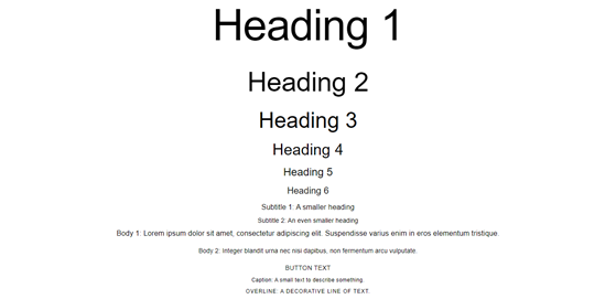
In this example, we’ve used various Material-UI Typography variants to showcase different text styles:
- Headings (h1 to h6) demonstrate different heading styles.
- Subtitle variants (subtitle1 and subtitle2) show smaller headings suitable for subtitles.
- Body variants (body1 and body2) display paragraph text with different font sizes.
- The “button” variant is used for text that resembles a button.
- “Caption” is used for small descriptive text.
- “Overline” is used to create decorative text with a line above it.
Props of Typography and its values
In Material-UI, the Typography component allows you to apply various typographic styles to your text elements. You can control the appearance of text by using props to specify different aspects of typography. Here are some of the important props of the Typography component in Material-UI and their possible values:
- variant:
- Values: “h1”, “h2”, “h3”, “h4”, “h5”, “h6”, “subtitle1”, “subtitle2”, “body1”, “body2”, “button”, “caption”, “overline”
- Description: Specifies the typography variant to be used. Each variant corresponds to a predefined set of font size, weight, and style.
- color:
- Values: “initial” (default), “inherit”, “primary”, “secondary”, “textPrimary”, “textSecondary”, “error”
- Description: Defines the text color. You can use theme colors such as “primary” and “secondary,” or specify “inherit” to inherit the color from the parent element.
- align:
- Values: “inherit” (default), “left”, “center”, “right”, “justify”
- Description: Sets the text alignment within the component.
- gutterBottom:
- Values: boolean (true or false)
- Description: Adds a bottom margin to the text, providing spacing between adjacent elements.
- noWrap:
- Values: boolean (true or false)
- Description: Prevents text from wrapping to the next line when it exceeds the container’s width.
- paragraph:
- Values: boolean (true or false)
- Description: Adds additional spacing between paragraphs for improved readability.
- component:
- Values: Any valid HTML element or a custom React component
- Description: Specifies the underlying HTML element or custom component to render as the Typography. For example, you can use “div” or “span” to change the default rendering element.
- style:
- Values: An object containing CSS styles
- Description: Allows you to apply custom inline styles to the Typography component.
Customizing Typography
Material-UI allows you to customize typography according to your design requirements. You can override the default typography settings by using the createTheme function. Here’s an example of how you can create a custom typography theme:
import { createTheme, ThemeProvider } from "@mui/material/styles";

// Define your custom theme using createTheme
const theme = createTheme({
  typography: {
    fontFamily: "Arial, sans-serif", // Change the default font-family
    h1: {
      fontSize: "2.5rem", // Increase the font size for h1
      fontWeight: 700, // Increase the font weight for h1
    },
    h2: {
      fontSize: "2rem", // Customize h2 font size
    },
    body1: {
      fontSize: "1rem", // Customize body text font size
      lineHeight: 1.5, // Adjust line-height for better readability
    },
  },
  palette: {
    primary: {
      main: "#007bff", // Change the primary color
    },
    secondary: {
      main: "#ff5722", // Change the secondary color
    },
  },
});

    <ThemeProvider theme={theme}>
        <Container>
          <Typography variant="h1" gutterBottom>
            Customized Heading 1
          </Typography>
          <Typography variant="h2" gutterBottom>
            Customized Heading 2
          </Typography>
          <Typography variant="body1" paragraph>
            This is a customized body text with a different font size and
            line-height.
          </Typography>
          <Typography variant="body1" color="primary">
            This text is in a custom primary color.
          </Typography>
          <Typography variant="body1" color="secondary">
            This text is in a custom secondary color.
          </Typography>
        </Container>
   </ThemeProvider>
Here’s what the output would look like:
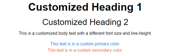
In this example:
- We define a custom theme using createTheme and customize the fontFamily, font sizes, font weights, line heights, and colors.
- The customized theme is then wrapped around the Material-UI components using the ThemeProvider.
- Inside the ThemeProvider, we use the Typography component with the custom variants and colors.
Responsive Typography
Responsive design is crucial in modern web development. Material-UI makes it easy to create responsive typography using its breakpoints system. You can define different typography settings for various screen sizes:
import { createTheme } from '@mui/material/styles';

// Define a custom theme with responsive typography
const resTheme = createTheme({
  typography: {
    h1: {
      fontSize: "2.5rem", // Default font size
      fontWeight: 700, // Default font weight
    },
    body1: {
      fontSize: "1rem", // Default font size
    },
    // Define responsive typography
    [theme.breakpoints.up("sm")]: {
      h1: {
        fontSize: "3rem", // Larger font size for screens >= 600px width
      },
      body1: {
        fontSize: "1.25rem", // Larger font size for screens >= 600px width
      },
    },
    [theme.breakpoints.up("md")]: {
      h1: {
        fontSize: "4rem", // Even larger font size for screens >= 960px width
      },
      body1: {
        fontSize: "1.5rem", // Even larger font size for screens >= 960px width
      },
    },
  },
});


  <ThemeProvider theme={resTheme}>
       <Container>
          <Typography variant="h1" gutterBottom>
            Responsive Heading 1
          </Typography>
          <Typography variant="body1" paragraph>
            This is a responsive body text that adjusts its size based on screen
            width.
          </Typography>
        </Container>
   </ThemeProvider>
Here’s what the output would look like:
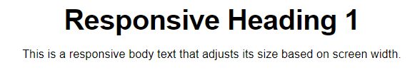
In this example:
- We define a custom theme using createTheme and specify default font sizes for h1 and body1.
- We use the theme.breakpoints.up function to define different font sizes for larger screens.
- When the screen width is at least 600px (sm breakpoint) or 960px (md breakpoint), the typography for h1 and body1 adjusts to larger font sizes.
Typography Best Practices
When working with typography in Material-UI, keep these best practices in mind:
- Choose legible fonts that match your application’s style.
- Maintain consistency by using typography variants appropriately.
- Prioritize accessibility by ensuring sufficient contrast between text and background.
- Test your typography on different devices and screen sizes for responsiveness.
Conclusion
Material-UI’s typography system empowers React developers to create visually appealing and readable interfaces with ease. By leveraging predefined variants and customizing typography settings, you can craft beautiful and responsive designs that align with your application’s branding.
Incorporating Material-UI’s typography principles into your React projects will not only enhance the user experience but also contribute to a polished and professional look for your web applications. Start using Material-UI’s typography today to unlock the full potential of typography in your React projects.

