

In this article, we’ll delve into the world of PrimeReact and explore how it enhances the capabilities of React by providing a comprehensive set of UI components and tools.
What is a component Library?
A component library is a collection of pre-designed, reusable user interface elements that can be easily integrated into applications to create consistent and visually appealing interfaces. These libraries offer a set of building blocks that developers can leverage to save time, streamline development, and ensure a uniform look and feel across different parts of an application. A well-designed component library, such as PrimeReact, provides a variety of benefits for developers and designers alike.
Components and Their Role
Components are the fundamental building blocks of user interfaces in web development. They are modular, self-contained units that encapsulate specific functionality and visuals. In a component library, these components are meticulously crafted and optimized for various use cases, eliminating the need to start from scratch every time a new UI element is required.
Benefits of Using a Component Library
- Consistency: Component libraries enforce a consistent design language and user experience throughout an application. This is crucial for maintaining a professional appearance and improving user satisfaction.
- Efficiency: Developers can save time and effort by reusing existing components rather than coding them from scratch. This leads to faster development cycles and shorter time-to-market.
- Quality Assurance: Component libraries often undergo rigorous testing and refinement, ensuring that the components are bug-free and well-optimized for performance.
- Design and Development Collaboration: A component library bridges the gap between designers and developers. Designers can create mockups using the actual components, ensuring a more accurate representation of the final product.
- Scalability: As projects grow, maintaining a consistent design and functionality becomes challenging. Component libraries streamline scalability by offering a standardized way to add new features.
- Customization: While components in a library have a predefined look and behavior, they are usually customizable. Developers can adjust styles, behavior, and even functionality to suit the specific requirements of their application.
- Accessibility: Many modern component libraries prioritize accessibility by implementing best practices and ensuring that the components are usable by individuals with disabilities.
What is PrimeReact?
PrimeReact is a popular open-source UI component library designed specifically for React applications. It’s built on top of the PrimeOne Design, which aims to deliver a consistent and visually appealing user experience across various devices and screen sizes. The library offers a wide range of customizable components, such as buttons, forms, data tables, charts, and more, making it an ideal choice for creating professional-looking applications with minimal effort.
Getting started with PrimeReact
Integrating PrimeReact into your React project is straightforward. You can install the PrimeReact package using npm or yarn, and then import the desired components into your application. The PrimeReact documentation provides comprehensive examples and guidelines to help you get started quickly.
PrimeReact’s Component Library
PrimeReact is a prime example of a robust component library. It offers an extensive collection of UI components that cover a wide range of use cases, from basic buttons and forms to complex data tables and charts. Each PrimeReact component is designed with attention to detail, responsiveness, and performance in mind. Here are some examples of components you might find in PrimeReact:
- Buttons
- Input fields and forms
- Data tables
- Charts and graphs
- Accordions and tabs
- Modals and dialogs
- Menus and navigation elements
Using Components from PrimeReact
To use components from PrimeReact or any other component library, developers typically follow these steps:
- Installation: Install the component library using a package manager like npm or yarn.
- Import: Import the desired components into your React application.
- Integration: Integrate the imported components into your application’s code, utilizing their properties and methods.
- Customization: Customize the components as needed, adjusting styles, behavior, and other properties.
Let’s now install and use the primeReact in our React project.
Using PrimeReact
Here’s a step-by-step guide on how to install and set up PrimeReact in your React project:
Create a React Project
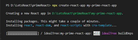
If you haven’t already, start by creating a new React project using a tool like Create React App (CRA). Open your terminal and execute the following command:
npx create-react-app my-prime-react-appReplace “my-prime-react-app” with your preferred project name.
Navigate to Project Directory
Navigate to the project directory using the following command:
cd my-prime-react-appInstall PrimeReact
To install PrimeReact and its required dependencies, use npm or yarn. In this example, we’ll use npm
npm install primereact primeiconsOr if you prefer using yarn:
yarn add primereact primeicons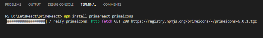
Import PrimeReact CSS
PrimeReact components come with their own CSS styles. Import the PrimeReact CSS into your project. In your “src/index.js” (or src/index.tsx if using TypeScript) file, add the following import statement at the top:
import 'primereact/resources/primereact.min.css';
import 'primeicons/primeicons.css';
Start Using PrimeReact Components
You’re now ready to start using PrimeReact components in your React application. Import the desired components into your components or pages, and integrate them into your UI as needed.
For example, if you want to use a PrimeReact button component, you can import it in one of your components like this:
import React from 'react';
import { Button } from 'primereact/button';

const MyComponent = () => {
  return (
    <div className="App">
      <div className="buttons">
        <Button label="Click Me!" className="btn"/>
        <Button label="Link button" link className="btn"/>
        <Button label="Primary" className="btn"/>
        <Button label="Secondary" severity="secondary" className="btn"/>
        <Button label="Success" severity="success" text raised className="btn"/>
        <Button label="Info" severity="info" text raised className="btn"/>
      </div>
    </div>
  );
};

export default MyComponent;

Customize and Use Components
PrimeReact components come with various props that allow you to customize their appearance and behavior. You can pass these props as needed to achieve the desired look and functionality for your application.
Advantages of Using PrimeReact with React
- Rich Component Library: PrimeReact provides an extensive collection of pre-designed components that can be easily integrated into your React application. This saves a significant amount of development time and effort, as you can leverage these components to build sophisticated interfaces without starting from scratch.
- Consistency and Visual Appeal: PrimeReact’s components are designed with a consistent visual style, adhering to modern design principles. This ensures that your application maintains a polished and professional look across all its parts.
- Customization Options: While PrimeReact offers ready-to-use components, it also allows for customization. You can adjust the appearance, behavior, and styles of the components to match your application’s unique branding and requirements.
- Responsive Design: PrimeReact components are built to be responsive, adapting gracefully to different screen sizes and orientations. This is crucial in today’s mobile-first world, where users access applications on a variety of devices.
- Performance: PrimeReact components are optimized for performance, ensuring smooth interactions and fast rendering. This is particularly important when dealing with complex user interfaces and data-heavy applications.
Clone the repository here for running the demonstration in your system:
Summary
In conclusion, PrimeReact stands as a dynamic catalyst in the world of React application development, offering a treasure trove of meticulously designed UI components. With its robust component library, PrimeReact empowers developers to create polished, responsive, and performance-optimized user interfaces with ease. By streamlining the development process, maintaining consistency, and enabling customization, PrimeReact becomes an invaluable asset for projects of all scales. By integrating PrimeReact into your React applications, you can elevate your design and functionality while reducing development time, ultimately resulting in enhanced user experiences and successful digital endeavors.


